Charles Melton
You shouldn't label things by what they look like, but we did
In short
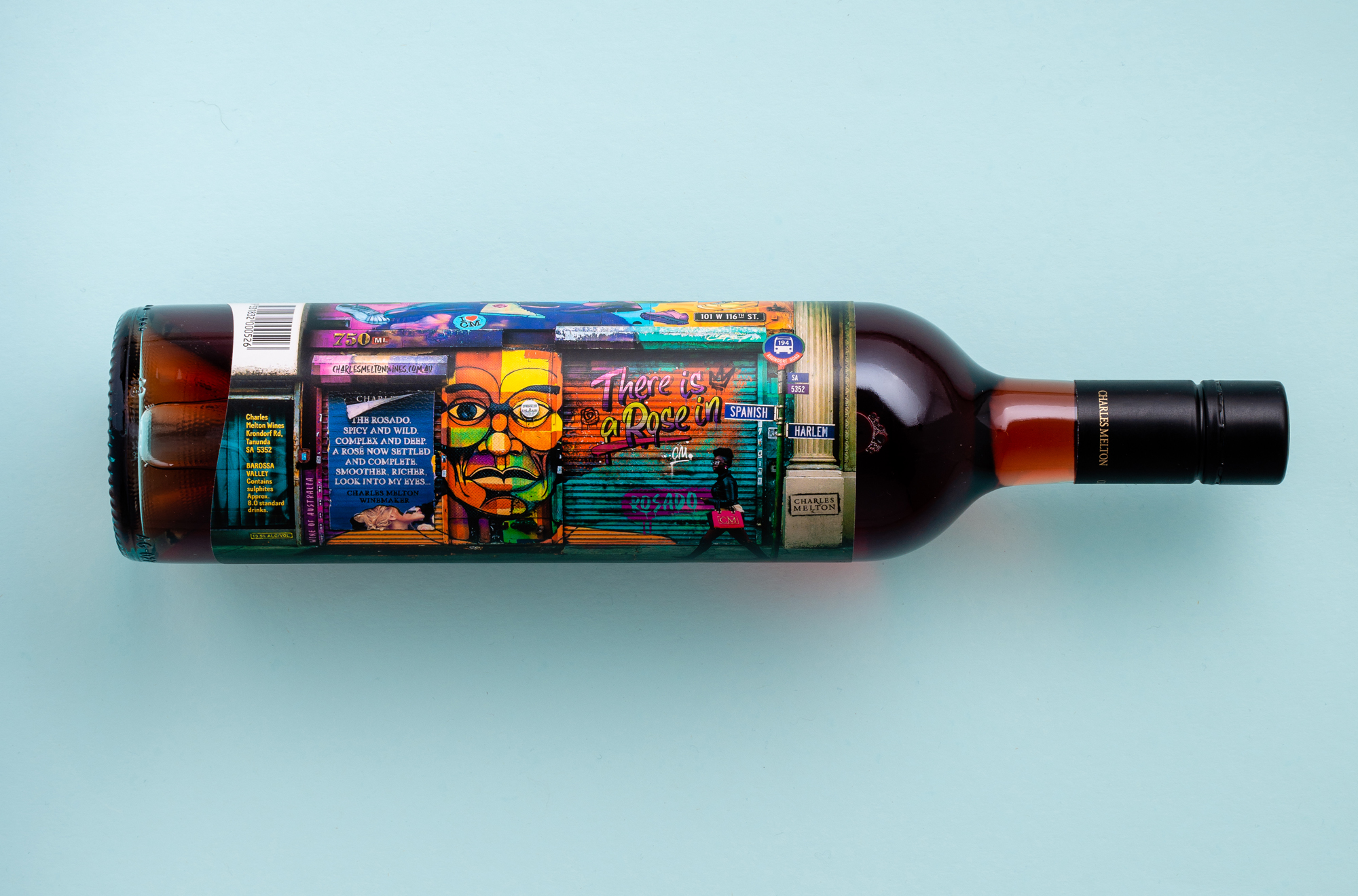
When Charles Melton created a new rose that was a departure from anything they’d ever done before, they need the label and packaging to reflect that this Rose was different. Inspired by the New York street scape our label design is strikingly eye catching. There more you look at it the more you see all the secret messaging that layered within the label. More than just vibrant colours on a page, this is clever design and packaging that stands out on the shelf.
Services
Design